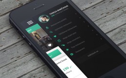
Match your desktop menu and mobile + tips
The visual coherence, we could say, is a series of rules that allow you to create a unified graphic style in publications and everything that has to do with your brand.
Just as in digital marketing strategies, coherence plays a key role in all aspects, web design does not fall outside this norm. The coherence in the image, palette of colors, icons, logos and more is important to generate an impression of order and professionalism among the users who enter your web page.
Although the theme you use is responsive as Divi, there are certain details that you should adjust since many times what you configure in the desktop version may not apply in the mobile version.
Today we will show you how to unify the menu of the desktop version with the mobile version and some extra tips that can help you to fully customize the mobile version of your website.
1. Configure the main menu
The first thing we must do is verify that the desktop menu has the appropriate measures, so we must go to:
- Appearance
- Customize
- Header and Navigation
- Primary menu bar
- There we will apply the following values:
Hide logo image: Disabled
Height of the menu: 30
Maximum height of the logo: 100
This configuration will reduce the height of the menu and we will seek to do the same in the mobile version so that it looks more elegant and create more space on the screen even if your main menu is not fixed.
2. Modify the mobile menu bar with CSS
To achieve this unification in the two menus, we will add a bit of CSS to make them look the same. The recommended thing is to apply the CSS to the whole website but we will show you how to do it for a particular page, for example, a landing page.
How to add CSS code to a single page?
To make the modification of the menu via CSS to a particular page, we will open the page in the WordPress Administration Panel. Then, inside the Divi Builder, we must click on the menu button, which has 3 parallel horizontal stripes.
In the custom CSS field, copy the following code:
 @media (max-width: 980px) {
# page-container {
padding-top: 43px! important;
}
}
@media (max-width: 980px) {
#logo {
max-width: 100%! important;
max-height: 90%! important;
}
}
@media (max-width: 980px) {
#mainheader {
top: 4%! important;
}
}
@media (max-width: 980px) {
# et-top-navigation {
padding-top: 5px! important;
}}
.et_header_style_split .mobile_menu_bar,
.et_header_style_left .mobile_menu_bar {
padding-bottom: 5px;
}
How to add CSS code to the entire web page?
This is the most used option because you do not have to take care of one page at a time and everything will look uniform. There are two ways to make this changes.
Add CSS code with the Theme’s Customizer
With this code, you will see the changes immediately, so you can make the necessary changes and when you are ready, save the changes.
To access this option we follow the following steps:
- WordPress Administration Panel
- Appearance
- Personalize
- Additional CSS
- In the Custom CSS field we will insert the following code:
 @media (max-width: 980px) {
# page-container {
padding-top: 43px! important;
}
}
@media (max-width: 980px) {
#logo {
max-width: 100%! important;
max-height: 90%! important;
@media (max-width: 980px) {
#mainheader {
top: 4%! important;
}
}
@media (max-width: 980px) {
# et-top-navigation {
padding-top: 5px! important;
}}
.et_header_style_split .mobile_menu_bar,
.et_header_style_left .mobile_menu_bar {
padding-bottom: 5px;
}
Add CSS code with Theme options
The second way to make these changes via CSS is through the Theme Options. The route is the following:
- WordPress Administration Panel
- Divi
- Theme Options
- “General” tab
- We paste the following code in the Custom CSS field:
 @media (max-width: 980px) {
# page-container {
padding-top: 43px! important;
}
}
@media (max-width: 980px) {
#logo {
max-width: 100%! important;
max-height: 90%! important;
}
}
@media (max-width: 980px) {
#mainheader {
top: 4%! important;
}
}
@media (max-width: 980px) {
# et-top-navigation {
padding-top: 5px! important;
}}
.et_header_style_split .mobile_menu_bar,
.et_header_style_left .mobile_menu_bar {
padding-bottom: 5px;
}
As you copy and paste the codes, verify within them the values you want to modify to meet the needs of your website, especially the top fill between the menu and the logo. Start by placing the highest values and little by little you reduce until you get the result you want.
Extra tips
How to make the mobile menu fixed
In the Additional CSS section of the Theme Customizer, copy this code and the mobile menu will be fixed.
 / * Divi fixed menu also in mobile * /
@media (max-width: 980px) {
.et_non_fixed_nav.et_transparent_nav # main-header, .et_non_fixed_nav.et_transparent_nav # top-header, .et_fixed_nav # main-header, .et_fixed_nav # top-header {
position: fixed! important; }}
How to hide the logo in the header mobile
- Enter the Divi Theme Customizer.
- Click on “Mobile styles.”
- Select Mobile Menu.
- Check “Hide logo image”.
- Save the changes.
How to add a different logo for the mobile version of your website
- In the “Media” section of your WordPress, add the logo image you want to add to the mobile version and copy the URL it generates.
- Add in your web the code that you will see below.
- Replace the URL of the code with the URL of the image you selected.
- Save the changes!
 @media only screen and (max-width: 981px) {
/ * Changes mobile logo to specified image * /
#logo {
content: url ("http://site.com/logo.png");
}
}
Test your website on different devices directly in Divi
In the Divi header settings, you will see the tablet, smartphone and desktop options. There you can verify in real time how the changes you make without using other tools appear on different devices.
As you can see, it is always good to customize our web pages to the last detail and verify that it looks and works well on all devices. Remember that the more minimalist and more space there is on the screen, the better the mobile experience will be. Also, be sure to optimize the images and elements that you upload to the website so that they work well within the design.
very much usefull, thanks
Is it possible to make mobile menu full screen like Squarespace has?
it’s very useful for me. thanks
This is useful information, and I used some of these strategies on my website. It’s very much appreciated.