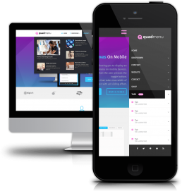
Off-canvas menus on mobile devices
This is one of the most beautiful layouts, allowing you to display a horizontal menu in large screens and a vertical menu on mobile devices.
Like the standard layout, the menu is displayed when the user presses the toggle button.
But unlike this, the off-canvas menu displays a menu that takes the 80% width of the screen with a sliding effect.