9.2. Themes Options
QuadMenu allows you to use more than one theme. Each theme is an instance of options that allows you to change the menu layout and style options.
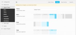
QuadMenu > Panel > Your Theme
In the main tab you can control the display options, related to how the menu and its elements will show on desktop and mobile devices.
The most important setting on this tab is the Layout setting which will define the behavior of your menu.
This option allows you to choose the screen size at which the menu collapses. You can type in the value in pixels, or you can use the slider. A collapsed menu doesn’t display links on the first level, instead, it shows an icon to display them.
This option allows you to force the menu width to fit the 100% of the screen.
Use this option to choose the behavior of the navbar container width.
Once you activate this option a new setting called Selector will be shown. Here you can include a class or id selector available in your and the container navbar width will be adjusted to 100% of the width of its container.
Usually the theme container is name:
- .container
- #container
- .main
- #main
- .content
- #content
The Lazyload option allows you to lazy loading the images inside your menu. This means loading images on websites asynchronously, that means that the images will be loaded once they are required.
This means that if users don’t open a dropdown, images placed inside it won’t even be loaded.
The Trigger option allows you to choose the action that the user has to carry out to display the dropdown menus first level.
Click: The first click will display the menu and the second click will access the link.
Hover: The mouse movement over the item will display the menu and the first click will access the link.
This hover function makes use of the hoverIntent jQuery Plugin. HoverIntent attempts to predict the user’s intent from the mouse movement.
It is similar to jQuery’s hover method, but instead of calling the handler function immediately, hoverIntent waits until the mouse slows down enough, before making the call.
This feature prevents accidental firing of animations or Ajax calls. Simple timeouts work for small areas, but if your target area is large, it may execute regardless of intent. This is where hoverIntent comes in.
Menu
Here you can customize the style of your menu, with parameters like text color, background, borders, margins, etc.
Sticky
Here you can activate and customize the style of your sticky menu.
Mobile
Here you can customize the style of your mobile menu.
Dropdown
Here you can customize the style of your dropdowns menus, with parameters like text color, background, borders, margins, etc.
Typography
Here you can customize the fonts of your main menu and the submenus.
Animation
Here you can include some animations for the menu elements like badges, titles, subtitles and dropdowns.